01 / Client website · Frontend development / Website
Building Skinny Cans for the Web
I was the sole developer responsible for translating the supplied Skinny Cans Figma design into a responsive production website. The project combined complex layered imagery, product storytelling and interactive components across desktop, tablet and mobile layouts.
- Role
- Frontend Developer
- Year
- June–October 2025.
- Client
- Skinny Cans — contracted through the project’s UI designer
- Stack
- Next.js · React · Tailwind CSS · TypeScript · next-intl · Zod · Framer Motion
Project overview
From Figma handoff to a live brand website
The Skinny Cans website was commissioned through a UI designer who contacted me to develop the supplied Figma design. I worked as the sole developer and received the visual assets through Google Drive.
My responsibility was to translate the approved interface into a responsive website while preserving the brand’s typography, imagery, layered compositions and product-focused storytelling.
The finished website was delivered and launched. It remains in use by the client. Because I worked through the UI designer, feedback from the business owner was communicated indirectly.
Scope and ownership
What I was responsible for
I independently developed the frontend from the supplied design and later expanded my copy of the project as a self-directed engineering exercise.
01
Frontend development
Pixel-accurate Figma implementation
Translated the supplied Figma design into reusable Next.js components while preserving its typography, layered imagery, decorative elements and brand-specific visual treatment.
02
Responsive design
Adaptive compositions across screen sizes
Reworked layouts containing absolute-positioned flowers, backgrounds and product imagery for desktop, tablet and mobile, including the positional corrections raised during design review.
03
Performance
High-resolution asset handling
Worked with source images exceeding 40 MB and used optimized formats, responsive sizing and Next.js image handling to preserve visual quality while reducing unnecessary delivery costs.
04
Internationalization
Three-locale routing architecture
Implemented English, Norwegian and Northern Sámi locale structures with next-intl, including translated routes, message dictionaries, language selection and English fallback behaviour.
05
Product experience
Reusable product and storytelling interfaces
Built reusable navigation, carousel, product, story, partner, science, age-verification and inquiry interfaces instead of treating every page as an isolated layout.
06
Engineering growth
Independent technical revision
Later strengthened my copy with product-data architecture, rate limiting, Vitest tests, Puppeteer browser checks, GitHub Actions CI and Architecture Decision Records while applying my growing AI-assisted development skills.
The challenge
Preserving visual quality without sacrificing performance

The supplied design relied on high-resolution product imagery, decorative flowers and several overlapping background elements. Some original assets exceeded 40 MB, creating a challenge between preserving the visual quality of the design and maintaining reasonable website performance.
The decorative elements also depended heavily on absolute positioning. They had to be carefully adjusted across desktop, tablet and mobile layouts without losing the composition established in Figma.
The project also introduced me to next-intl. I needed to implement English, Norwegian and Northern Sámi locale structures while learning locale-aware routing, translation dictionaries and language switching for the first time.
The Norwegian and Northern Sámi content was produced with Google Translate and was not reviewed by native speakers. The client later removed the translations, so I treat them as draft localization work in my revised version rather than approved professional translations.
Responsive interface
One visual system across multiple experiences
The interface combines editorial brand storytelling, product discovery and partner-focused flows while preserving the supplied design across desktop and mobile viewports.
Frame 01 / 05
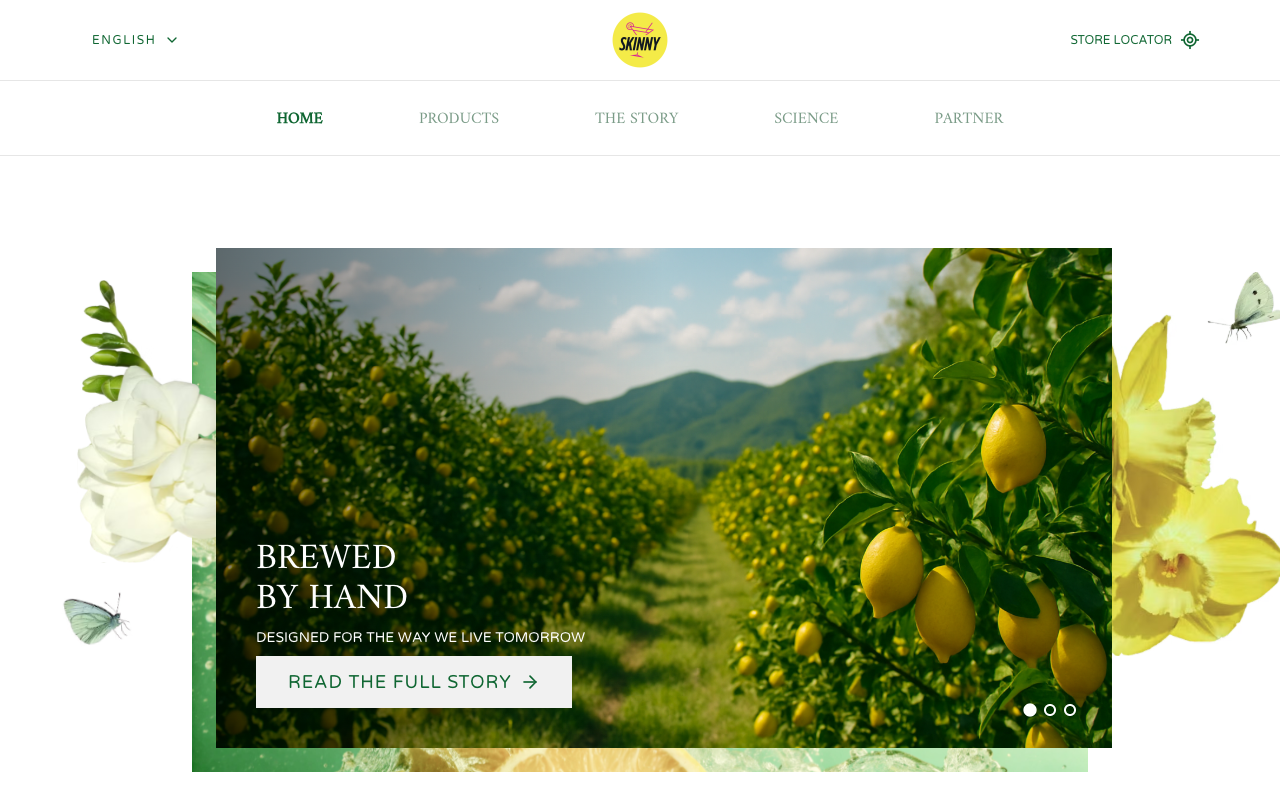
Desktop homepage
The main brand experience combines layered floral artwork, an animated carousel and product storytelling.
Frame 02 / 05
Responsive mobile experience
The desktop composition was reorganised for smaller screens while preserving the original visual direction.
Frame 03 / 05
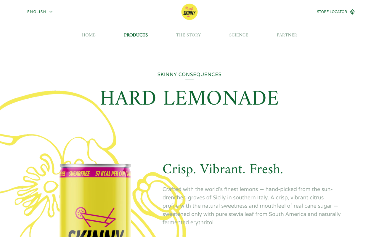
Product detail page
A reusable product page presents localized copy, product imagery and structured product information.
Frame 04 / 05
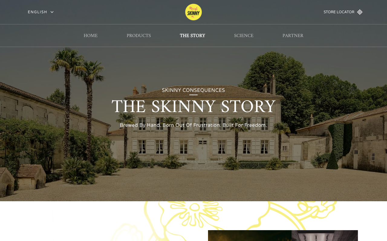
Editorial brand story
Long-form brand content is organised into visual sections while remaining consistent with the wider website.

Frame 05 / 05
Partner inquiry interface
A localized and validated form allows potential partners to choose a topic, describe their request and attach a supported document.
Development process
Turning a visual handoff into a maintainable frontend
The work progressed from reviewing the supplied design and assets to responsive implementation, localization, quality assurance and a later self-directed technical upgrade.
01 · Design handoff
Reviewing the Figma design and assets
I reviewed the supplied Figma screens, identified reusable interface patterns and organised the product images, illustrations and decorative files received through Google Drive.
Figma Review · Asset Inventory · Responsive requirements
02 · Architecture
Planning reusable components
I divided the interface into reusable navigation, carousel, product, story, partner, science, footer and form components so that shared behaviour did not need to be recreated on every page.
Component structure · Shared navigation · Reusable page sections
03 · Implementation
Building the responsive interface
I implemented the Figma layouts in Next.js and Tailwind CSS, then adjusted overlapping backgrounds, flowers, images and typography for desktop, tablet and mobile screens.
Responsive pages · Interactive carousels · Product layouts
04 · Localization
Introducing locale-aware routing
I learned and implemented next-intl to structure English, Norwegian and Northern Sámi routes, translation dictionaries, language switching and fallback behaviour.
Three locale structures · Language selector · Translation dictionaries
05 · Review and handoff
Refining the visual details
I tested the layouts at multiple viewport sizes and implemented minor corrections communicated through the UI designer, particularly around absolute-positioned decorative elements.
Responsive QA · Visual corrections · Source-code handoff
06 · Technical revision
Strengthening the project after delivery
I later upgraded my copy with automated tests, CI, architecture records, safer inquiry handling, rate limiting and a structured product-data source as part of my continued software-engineering development.
Vitest suite · Puppeteer checks · GitHub Actions · Architecture records
Technical implementation
Selected decisions from the revised codebase
After delivering the client website, I continued developing my copy to practise stronger localization, data modelling, testing and backend-facing validation patterns.
Choose an example to explore
3 code examples are available in this panel.
Click any option below
typescript
import {getRequestConfig} from 'next-intl/server'
export const locales = ['en', 'no', 'se'] as constexport type Locale = (typeof locales)[number]
export const defaultLocale: Locale = 'en'export const localePrefix = 'always' as const
export const languageNames: Record<Locale, string> = { en: 'English', no: 'Norsk', se: 'Sámegiella',}
export default getRequestConfig(async ({requestLocale}) => { let locale = await requestLocale
if (!locale || !locales.includes(locale as Locale)) { locale = defaultLocale }
try { const messages = ( await import(`../../messages/${locale}.json`) ).default
return { locale, messages, } } catch { const fallback = ( await import('../../messages/en.json') ).default
return { locale: defaultLocale, messages: fallback, } }})Locale loading with an English fallback
This configuration defines the website’s three locale structures, validates each requested locale and dynamically loads the appropriate message dictionary. If a locale or translation file cannot be loaded, the application falls back to English instead of leaving the visitor on a broken page.
Explore the build
Experience the revised Skinny Cans website
Explore the responsive interface, localized routes, product pages and interactive components directly within the case study.
Preparing preview
Loading isolated preview…
Tour 01
Explore the homepage
Move through the hero carousel and review how the layered composition responds to the available viewport.
Tour 02
Change the language
Use the language selector to switch between the English, Norwegian and Northern Sámi draft locale structures.
Tour 03
Open a product
Visit the product collection and open one of the generated product detail pages.
Results and reflection
A successful delivery that became a deeper learning project
The commissioned website was launched and remains in use. My later revision gave me a practical environment for strengthening localization, testing, CI, backend-facing validation and AI-assisted software development.
Outcome
Successfully launched
The completed website was delivered through the UI designer, launched by the client and remains in active use.
Outcome
Sole-developer delivery
I independently translated the supplied Figma design into the complete frontend and handled the responsive implementation, interactivity and source-code handoff.
Verified metric
30 pages
Statically generated in the revised build
The revised application currently generates 30 static route combinations across the three locale structures and two product pages.
Verified metric
34 tests
Passing automated checks
The current Vitest suite contains 34 passing tests covering localization, inquiry validation, API behaviour, SEO and interactive user journeys.
Verified metric
Learning
First substantial internationalization implementation
The project taught me how to structure localized routes, message dictionaries, fallback behaviour and language-aware interfaces with next-intl.
Learning
Applying AI knowledge responsibly
I used my developing AI knowledge to support research and iteration during the later upgrade while validating the results through tests, type-checking, linting, browser checks and production builds.
Skinny Cans began as a demanding Figma-to-code delivery and became a practical environment for improving my engineering discipline. If I continued the project, I would replace the draft machine translations with professionally reviewed copy, update outdated dependencies and further optimise the media pipeline.
